
Rebuilding an Independent Newsroom's Website
The Wire
A ground-up rework of how readers find, scan, and read news on one of India's leading independent journalism platforms from the homepage down to a single article.
The Wire launched on May 11, 2015, as an independent, non-profit Indian news platform, founded by Siddharth Varadarajan, Sidharth Bhatia, and M.K. Venu, and published under the Foundation for Independent Journalism. It runs on a reader-funded model rather than corporate or advertiser backing, and publishes across four languages including English, Hindi, Marathi, and Urdu.
CLIENT
ROLE
COMPANY
INDUSTRY
SCOPE
The Wire
Experience Design Intern
HumanX
Independent Media & Journalism
Website Redesign | Information Architecture | User Flow | UI Design | Mobile Responsive Design | Design System
MENTORS
Problem &
The Users
Everyday news readers checking headlines on the go, and dedicated readers who come specifically for long-form investigations and opinion pieces. Both groups needed to be served well, the redesign couldn't optimize for quick scanning at the cost of deep reading, or vice versa.
01
The old site felt cluttered and visually dated, out of step with the seriousness of the journalism on it
04
Mobile felt like an afterthought rather than a priority, despite being where most readers arrived
02
Navigation was inconsistent and hard to follow, with no clear logic to how sections were grouped
05
Branding varied enough page to page that it didn't feel like one consistent publication
03
Ad placement interfered with reading rather than sitting around it
06
None of it reflected what The Wire had actually become — an independent, reader-funded newsroom
Solution
As an Intern, I helped rebuild the site around one consistent system, shared typography, spacing, and layout rules instead of every page type being designed on its own.

Homepage
The homepage needed to do two things at once: surface the day's biggest stories immediately, and still make room for the slower, deeper journalism The Wire is known for. It's arranged in tiers — top stories sit at the very top with the most visual weight, section-level stories follow below in a more scannable grid, and opinion/long-form content gets its own dedicated space rather than getting pushed down and lost. That order isn't arbitrary — it mirrors how most readers actually use the site: check what's happening first, then decide if they want to go deeper.
Other pages
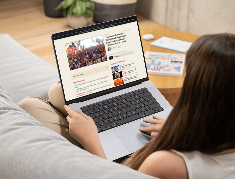
Article / Reading Page
Rebuilt around the reading experience itself: cleaner typography, more breathing room, and less competition from ads and surrounding clutter. Since this is where readers spend most of their actual time on the site, it got the most design attention.
Category Page
Each category page needed to work as a mini-homepage for that beat — showing the latest stories in the section at a glance while keeping the same visual hierarchy rules as the homepage (lead stories weighted higher, older stories receding into a simpler list), so a reader landing on any category page immediately recognizes the pattern from elsewhere on the site.
Author Page
Gave every author a consistent profile format — their recent articles, a short bio, and (where relevant) their beat — so readers following a specific journalist's work have one predictable place to find everything they've written, rather than having to piece it together from search.
About Us Page
Designed to do double duty: explain The Wire's mission and editorial independence clearly to new visitors, while also giving existing readers easy access to information about funding, governance, and the team — the kind of transparency that matters more for a reader-funded newsroom than for most other sites.

Built responsive from the start rather than adapted later, given how much of the readership arrives on mobile.
Mobile Version

Process
Worked in Figma, iterating from the old site's inconsistent structure toward a shared system that could carry across the homepage, sections, and articles alike. This project was also where I properly learned atomic design, building up from base elements (colors, type, buttons) into components, then patterns, then full page layouts which made it possible to keep hundreds of pages consistent without redesigning each one from scratch.
Prototyping was a big part of the process too moving from static screens to clickable prototypes to actually test how flows felt before handing anything off. A lot of the early direction came from competitor research: looking closely at how other news platforms (and well-designed digital products more broadly) handled layout, hierarchy, and navigation, then figuring out what of that logic genuinely applied to The Wire rather than copying patterns wholesale.
Day to day, the work was mostly designing screens in Figma and brainstorming content strategy alongside it, figuring out not just how something should look, but what content needed to be there and why. Designs went through rounds of client feedback, and revisions were made based on that input before anything moved forward which was a big part of actually learning how UI design works in practice, versus in a vacuum.
Reflection
This was my first time redesigning a large, information-heavy platform rather than a simple product, and it changed how I think about design systems, less about individual screens, more about rules that hold up across thousands of articles and situations I'd never personally see. It also reinforced something about redesigning legacy platforms in general: the visual fix is only half the job. The harder part is making the design actually reflect what the organization has become.
Ishita Neema
Experience Design Intern
